![Spotify's New Disco Ball Logo [2026]: What Happened?](https://pikinfo.com/wp-content/uploads/2026/05/spotify-new-disco-thumb.jpeg)
- Market Verdict: Spotify temporarily swapped its green sound wave logo for a shimmering disco ball icon in May 2026 to mark its 20th anniversary. The original logo returned the following week after significant user backlash.
- Reddit Consensus: Mixed-to-negative. r/mildlyinfuriating users called it “absolute horse shit.” r/iphone folks were calmer, clarifying it was just a temporary anniversary stunt. General vibe: unnecessary confusion for zero user benefit.
- Future Outlook: This episode joins a long list of brand logo controversies (Gap, Twitter, etc.) that show companies still haven’t figured out how to roll out visual changes without torching goodwill. Expect more of these moments — and faster reversals — as social media feedback loops keep tightening.
Morning, Pikers 🎯
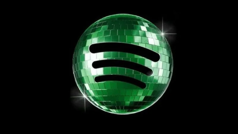
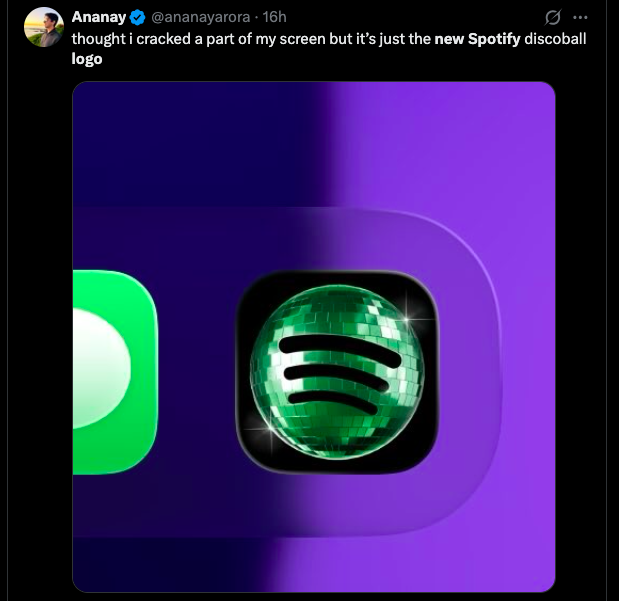
You opened Spotify last week and thought your phone was glitching. That familiar green circle? Gone. In its place: a shimmering, glittery disco ball staring back at you like it crashed the wrong party.
Imagine it — you’re in your car, Apple CarPlay on, and you genuinely can’t tell if Spotify is downloading an update or if someone hacked your phone. That’s not a hypothetical. That’s what actually happened to people.
Here’s the twist: the whole thing lasted less than two weeks. Spotify officially confirmed on May 17, 2026 that the old logo was coming back. But the damage — or at least the discourse — was already done.
So what actually happened? Why did they do it? And what does this whole episode tell us about how big platforms treat their users? Let’s get into it.
1. Spotify’s New Logo 2026: What Actually Changed
Spotify’s original logo is one of the most recognizable in tech. A green circle with three curved horizontal lines — clean, simple, immediately identifiable. You see it, you know it.
In early May 2026, Spotify replaced that icon with a disco ball. Not a full redesign — they kept the three curved lines, but the background became a reflective, shimmering sphere with glitter-like texture. Think Studio 54 meets your music app.
The reason? Spotify turned 20. According to USA Today, the disco ball logo was a deliberate anniversary celebration — part of a broader “Party of the Year” campaign that also included anniversary-related Wrapped content.
Here’s what nobody tells you: this wasn’t a small, quiet change. Spotify has hundreds of millions of users. Changing the app icon — the thing people tap every single day — is not like changing a banner on a website. It’s like rearranging someone’s kitchen without asking.
The Design Breakdown
2. Reddit Consensus: What Real Users Are Actually Saying
Reddit did not hold back. And honestly? The reactions are more nuanced than the headlines suggest.
r/mildlyinfuriating was the loudest. Users there called the new Spotify logo icon “absolute horse shit” — which, fair. The frustration wasn’t really about design taste. It was about being surprised. Nobody asked for this. It just appeared.
But here’s the part that’s actually interesting. Some users on r/NonPoliticalTwitter reported genuinely mistaking the animated, shimmering logo for an app update download indicator on Apple CarPlay. That’s a real usability problem. If your new branding makes people think their software is broken, you’ve failed the basic design test.
Meanwhile, r/iphone was noticeably calmer. Those users quickly clarified it was just a temporary anniversary icon and pointed out that Spotify also dropped anniversary Wrapped content alongside it. The tech-savvy crowd figured it out fast. Everyone else? Not so much.
The BBC noted that while negative reactions were loud, they don’t represent universal opinion — some users genuinely liked the festive vibe. Creative Bloq called it “divisive,” which is probably the most accurate word for it.
Wait — this is important. The split reaction isn’t just about taste. It’s about expectation. People who use an app every day have a muscle memory relationship with its icon. Changing it without warning breaks that. Even temporarily.
3. Spotify Logo Change 2026: Timeline & Data
One line from Spotify’s official statement says everything: “We know glitter is not for everyone.”
That’s corporate-speak for “we heard you, we’re reversing this.” But notice what they didn’t say: “we should have tested this first” or “we should have told you it was coming.” The apology was charming. The self-awareness? Less so.
4. Why Companies Keep Doing This (And Will Keep Doing It)
This isn’t the first time a major brand changed a logo and got torched for it. And it won’t be the last.
Remember the Gap logo disaster in 2010? They spent a reported $100 million on a rebranding that lasted exactly 6 days before they reversed it after a social media firestorm. Twitter’s rebrand to “X” in 2023 cost them years of brand equity overnight. Even Instagram’s icon redesign in 2016 generated more than 125,000 negative tweets in the first 24 hours.
Here’s the pattern: big platforms treat logo changes as marketing moments, not user experience decisions. The disco ball was designed to generate press coverage and social chatter — and it worked. You’re reading about it right now.
But here’s what nobody tells you about that strategy: the chatter is mostly negative. Anger travels faster than delight on social media. So you get coverage, sure — but the sentiment is upside down.
The Bigger Pattern: Logo Controversies vs. Reversals
The Spotify case is actually closer to the Gap disaster than the Instagram one. The key difference is that Spotify framed it as temporary from the start — they called it a “temp glow up.” That gave them an exit ramp. Smart move, even if the rollout was clumsy.
5. The Real Problem Nobody’s Talking About
Let’s be honest about something. The logo itself is fine. Glittery, yes. Unnecessary, probably. But it’s not offensive.
The actual problem is the lack of warning. Hundreds of millions of people woke up one day and their Spotify icon looked different. No push notification. No in-app message. No “hey, we’re celebrating our birthday, here’s what’s changing.” Just — surprise.
That’s a user experience failure, not a design failure.
And the Apple CarPlay confusion thing? That’s legitimately bad. The Tab reported that users couldn’t tell if the shimmering animation meant the app was loading, updating, or broken. In a car. While driving. That’s not a minor UX quirk — that’s a safety-adjacent issue.
If you’re thinking “no way, people can figure that out” — it’s real. The reflective, animated quality of the disco ball genuinely mimicked what a progress indicator looks like on some interfaces. This is exactly what happens when marketing teams and product teams don’t talk to each other before shipping.
What Should Spotify Have Done?
- 📣 Announce it in advance — a simple “our birthday is coming, look for a special icon” tweet would have flipped the sentiment entirely
- 📱 In-app notification — one banner explaining the change takes 30 minutes to build and prevents thousands of confused support tickets
- 🧪 User test the animation — specifically on CarPlay and Android Auto before shipping
- 🗓️ Set a clear end date publicly — they eventually said “next week” but waited until backlash forced them to
This is the part that matters: none of these fixes are hard. They’re all standard practice. The fact that Spotify skipped them suggests the decision was rushed, top-down, or both.
Pik’s Take 🎯
Three things I want you to walk away with:
1. The reversal is the real story, not the logo. Spotify caved in under 2 weeks. That’s fast. It means the internal feedback — from users, from social listening, maybe from support ticket volume — was significant enough to override whatever marketing value they expected. Social media feedback loops have gotten genuinely fast. Companies that ignore them are playing a losing game in 2026.
2. “Temporary” is the new risk management. Notice how Spotify called this a “temp glow up” from day one. That framing was deliberate. It gave them an exit without admitting failure. Expect more brands to use this playbook — launch controversial changes as “limited editions” or “celebrations” so they can reverse without a full PR crisis. It’s cynical but effective.
3. The CarPlay confusion is a preview of a bigger problem. As more interfaces become ambient — cars, smart TVs, wearables — brand visual changes have real-world consequences beyond aesthetics. A confusing icon on your phone is annoying. A confusing icon on your dashboard while you’re driving is something else. Design teams need to think in terms of every surface their icon lives on. Most of them aren’t doing that yet.
So What Does This Actually Mean for You?
Honestly? For most Pikers, the direct impact is zero. Your Spotify still works. Your playlists are intact. The disco ball is gone.
But here’s why this episode is worth 5 minutes of your attention:
- 🔍 It shows how fast platforms respond to collective pressure now — less than 2 weeks from launch to reversal. That’s the power of coordinated community feedback.
- 🧠 It’s a reminder to read the room before panicking — if your app looks different tomorrow, check Reddit before assuming you’ve been hacked. r/iphone and r/technology will have the answer within minutes.
- ⚠️ If you’re in product or design — screenshot this whole episode. It’s a textbook case of what happens when you skip user communication on a high-visibility change.
The bottom line, Pikers: Spotify turned 20, threw a party nobody was invited to, and then cleaned up the confetti when people complained. Classic big tech energy.
But the fact that they reversed it? That part’s actually encouraging. It means the feedback loop works — when enough people say something clearly enough.
📱 Get Pik’s daily briefings on Telegram → t.me/pikinfo
🔗 Found this useful? Share it with a Piker → pikinfo.com/spotify-new-disco-ball-logo-2026
“, “category”: “Tech & Culture”, “tags”: [“Spotify”, “new Spotify logo”, “Spotify disco ball”, “Spotify 20th anniversary”, “app icon change”, “brand redesign”, “Spotify 2026”, “logo backlash”], “faq_schema”: [ {
“question”: “Why did Spotify change its logo to a disco ball?”, “answer”: “Spotify changed its logo to a shimmering disco ball design in May 2026 to celebrate the platform’s 20th anniversary. It was part of a broader ‘Party of the Year’ campaign that also included anniversary Wrapped content.” },
{
“question”: “Is the Spotify disco ball logo permanent?”, “answer”: “No. Spotify confirmed on May 17, 2026 that the disco ball logo was a temporary change. The company called it a ‘temp glow up’ and announced the original green logo would return the following week.” },
{
“question”: “When is the original Spotify logo coming back?”, “answer”: “Spotify announced on May 17, 2026 that the original green sound wave logo would return the week of May 19, 2026, following significant user backlash.” },
{
“question”: “Why are users upset about the new Spotify logo?”, “answer”: “Users were frustrated by the unannounced change, with some on r/mildlyinfuriating calling it ‘absolute horse shit.’ A specific concern was that the shimmering, animated disco ball icon confused users on Apple CarPlay, who mistook it for an app update in progress.” },
{
“question”: “What does the new Spotify disco ball logo look like?”, “answer”: “The disco ball logo replaced the flat green background with a shimmering, reflective silver sphere. The three curved horizontal lines from the original logo were retained in the same position.” }
],
“share_snippet”: “Spotify swapped its logo for a disco ball and reversed it in under 2 weeks. Here’s what actually happened and what it tells us about big tech’s relationship with users: pikinfo.com/spotify-new-disco-ball-logo-2026”, “pinterest”: “Spotify’s new disco ball logo for its 20th anniversary in May 2026 — a shimmering silver sphere replacing the iconic green icon. The temporary Spotify logo change sparked major backlash and was reversed within two weeks. Visual comparison of old vs new Spotify app icon 2026.
This guide reflects 2026 consensus based on Reddit discussions, technical benchmarks, and predictive market data. Projections (including price predictions) are highly speculative and should not be considered financial advice.